In this tutorial, you will find a step by step guide on how to create a website mockup using photoshop. Basically, we'll start a design with a pen and paper drawing rough sketches about the elements that we'll add in a website and their placements and size but here we'll imitate an existing design that'll help you learn about all the tools we require while creating mocksups.
Photoshop is a huge application and consists a lot of tools that'll need a huge amount of time and dedication to become a pro in those tools but for webdesign we can get away with few basic tools like move tool, selection tool, color picker tool, pen tool, shape tool, filters and the blending options.
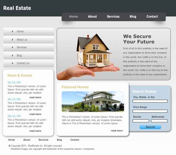
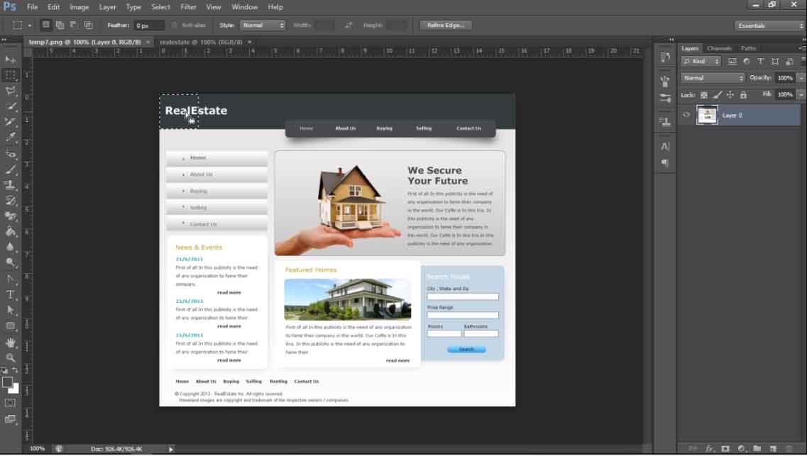
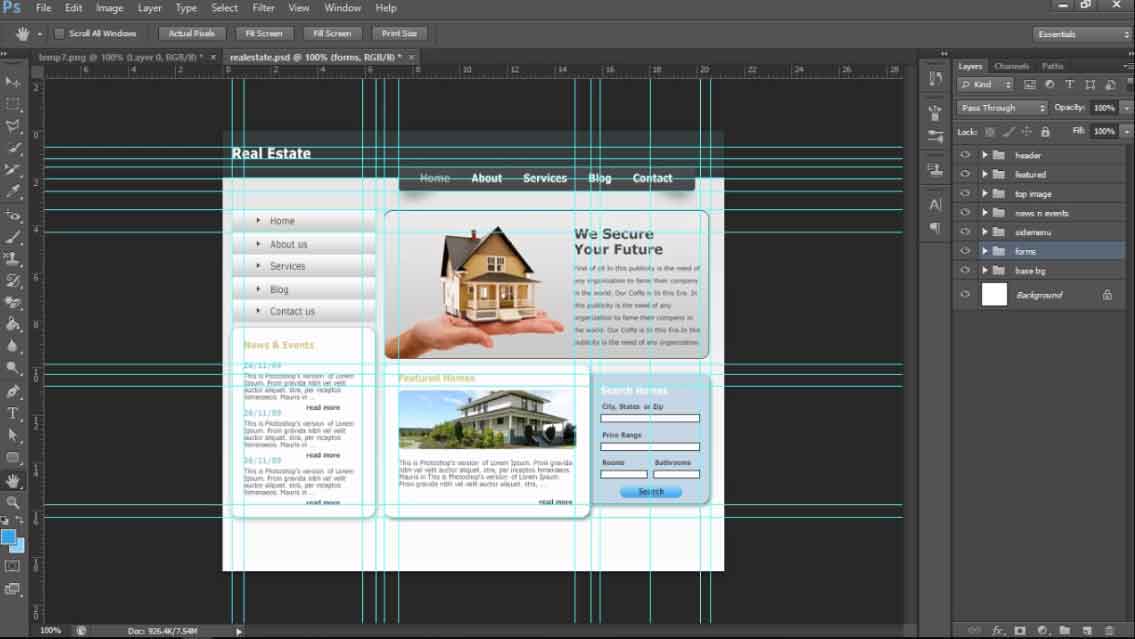
Here's the website design that we're going to imitate using photoshop.
If you are among one of those who would prefer a video tutorial instead then here's a video on the same topic.
Apart from the basic website elements like texts and images and their placements, we'll get to learn how to create shadows, buttons and gradient backgrounds in this design using photoshop. Lets get started then.
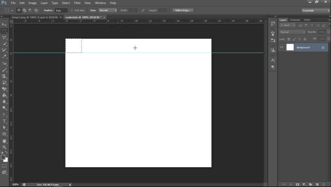
Create a New File
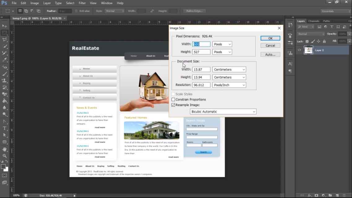
Basically, we'd start with a canvas with width in between 1020 to 1440px and a height of 1200 to 2000px but in this case we can find the exact size of the design page we're going to imitate and can use the same size for our canvas. Open the original file in Photoshop and go to Image > Image Size to view the original file size. You can see the canvas width and height in pixels as well as other measurement units there as shown below.
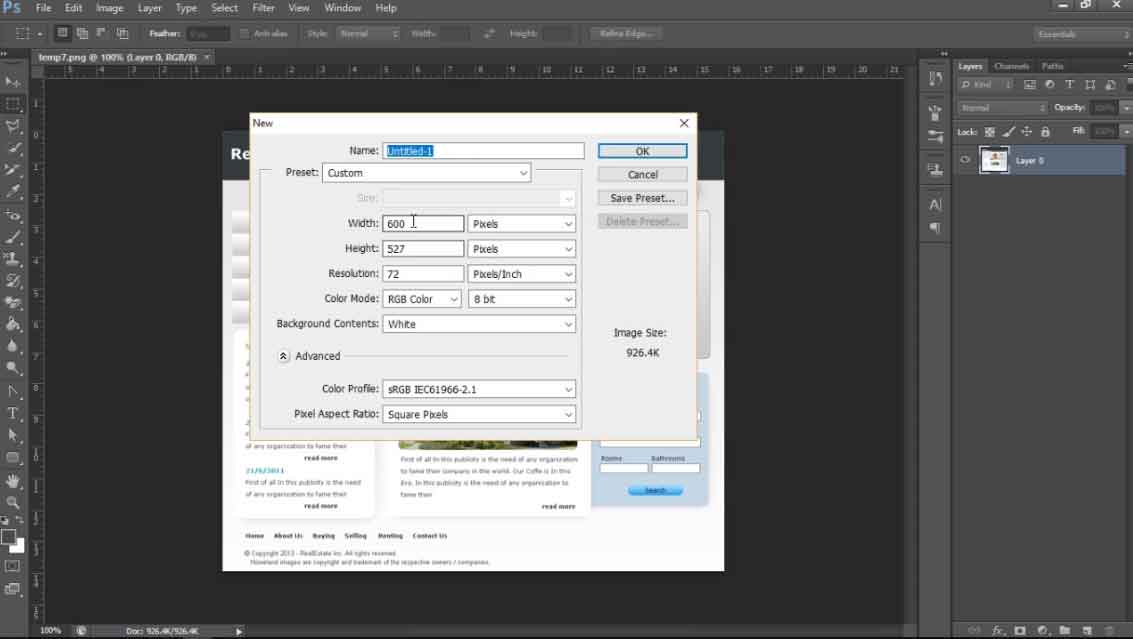
Now, go to File > New and fill up the same details for your new file with Resolution 72 pixels/inch, Color Mode RGB 8 bit and Background White. You can give a name to your file too in the Name field. Click OK to get a new file with those specifications.
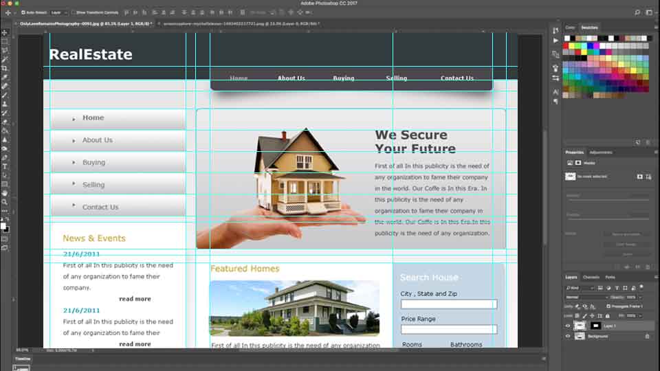
Go to View > Actual Pixels or use shortcut CTRL + 1 on both the files to view their actual size. It'll make both file size equal on the document area and we'll be able to measure dimensions of each elements, sections and spacings and imitate them easily.
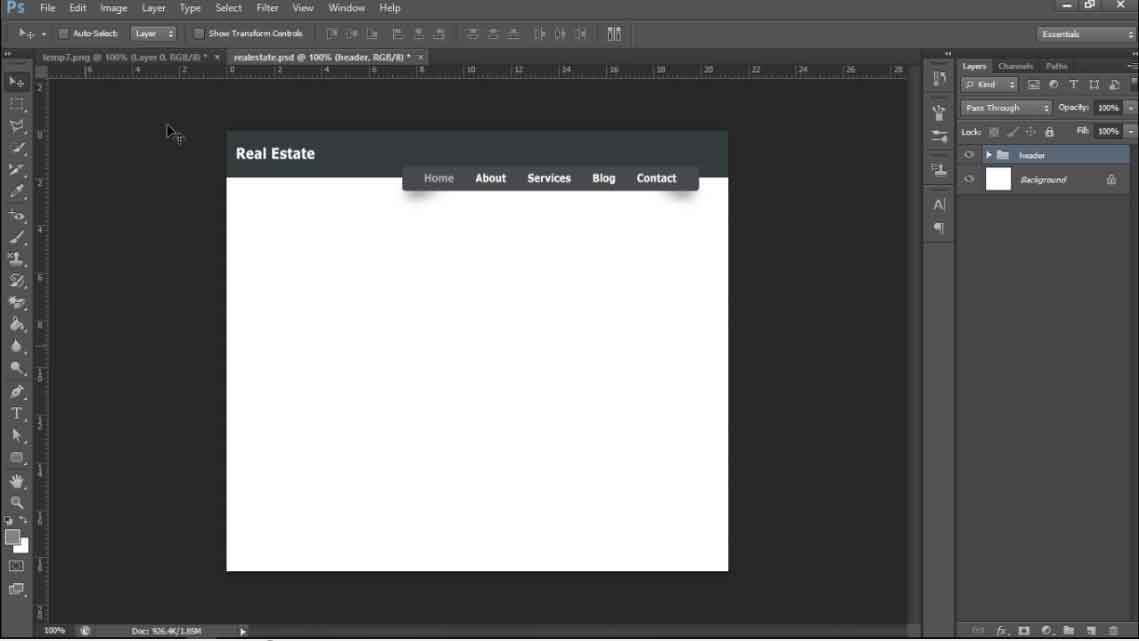
Create Header
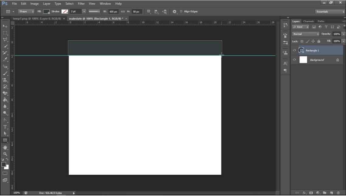
Let's start from the top then by measuring the header background's height as it's a full width content we don't need it's width. Select Rectangular Marquee Tool and draw a selection starting from the top to the bottom of the header background.
Drag the selection to the new file tab and release it on the new file document area once it's opened. Align it on the top. Click and drag the horizontal ruler above the document area and place it at the bottom of the selection. That'll give you a custom guideline and that'll be the end of the header background. If you don't see the ruler then go to View > Ruler and it'll appear on top and left hand side of the document area.
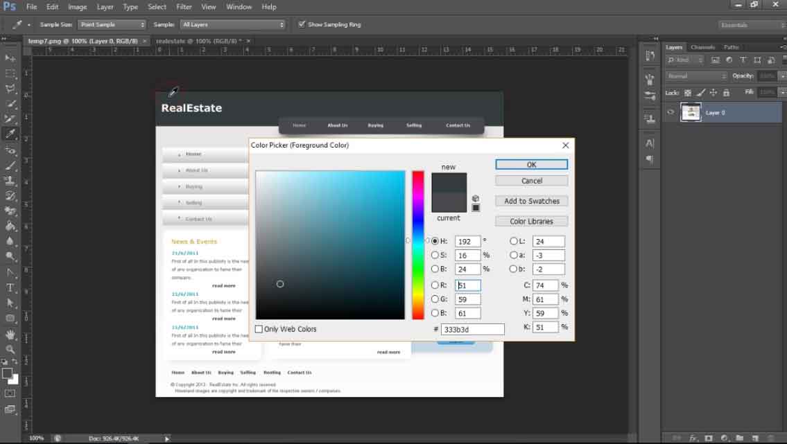
Let's get the header background color before creating the rectangle for header. Go back to original file and click on the foreground color pallette. A color box will appear and your cursor will change to color picker. Click on the header area to pick the background color and click ok to get that color as your foreground color. You can use the color picker tool too to do that but in the long run this one will be more convenient.
Now, go to your new file and select the Rectangle Tool. Select Shape option from the option abr and you'll see the color you just picked being selected as your Fill Color. We won't be adding border to this shape so select No Color option on stroke and the Size and Style options will be void. Draw a full width rectangle upto the guideline and your header background is done.
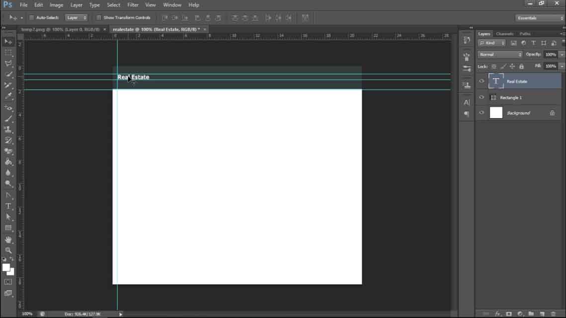
Now, we can go back to the original file and measure the spacings for the website name on the left of the header. Take measurement from all sides in relation to the background and create guidelines for the same. With the new Type > Match Font option from versions above Photoshop CC 2015 you can find out the font type being used in an image but for now we'll search for a look alike font and match the size using guidelines.
Then, select the Horizontal Type Tool from the tools bar, select desired options from the options bar for the text. Select the layer above which you want to add the text and click on the area. Since the base layer here is a shape layer, the text will be aligned vetically on the top of the shape although we click on any area. Type the text, make desired adjustments and move it between the guidelines.
Lets go to the menubar then. Measure it's spacing from all sides, drag those measurements to the new file one by one and create guidelines.
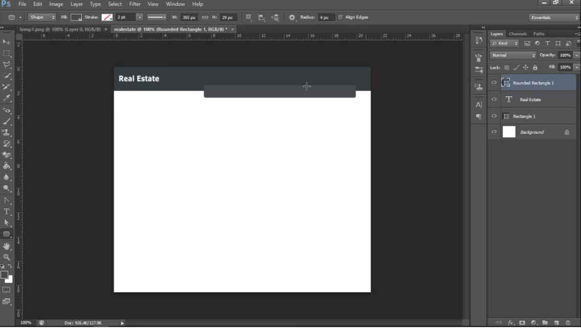
Since it's a rectangle with rounded corners, we'll use Rounded Rectangle Tool with Radius 4px and create a rounded rectangle within the guidelines. We learnt how to define the fill color for shapes prior to creating them, we can do the same selecting the shape tool even after creating shpaes. But here we'll show you how you can change the fill color without being bothered about the tool being selected. So the shape is created and we haven't picked the fill color yet. Go to the original file and use foreground or background color pallete oe the colorpicker tool to select the fill color for the menubar. Go to the new file and double click on the shape icon on the layers panel. A color box will appear while the cursor changes to colorpicker. Click on the color pallete either foreground or background where you sampled the fill color from the original file and click ok and you're done. Go to View > Extras to hide those guidelines and have a cleaner view of your work so far.
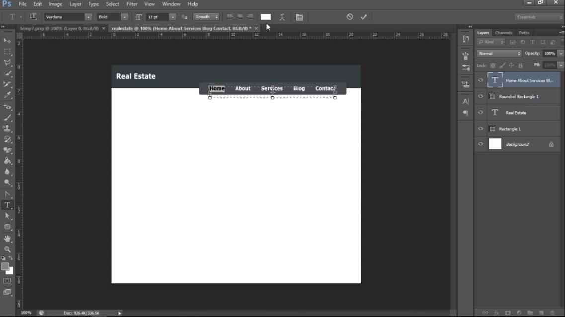
Now, take the measurements for spacing on the left and right of the menubar and create guidelines. Select text tool and click it and drag it to create a virtual textbox with the inner space of the menu bar. Type all the menu titles with single spacing between the words make necessary adjustments regarding size, style and type. Click on the Paragraph Panel Icon to view the paragraph panel and select Justify All to get them equally spaced from left to right end. Make sure you've all the values there reset or else it'll apply settings from previous file. That's done then. Hide the guidelines to have a clean view.
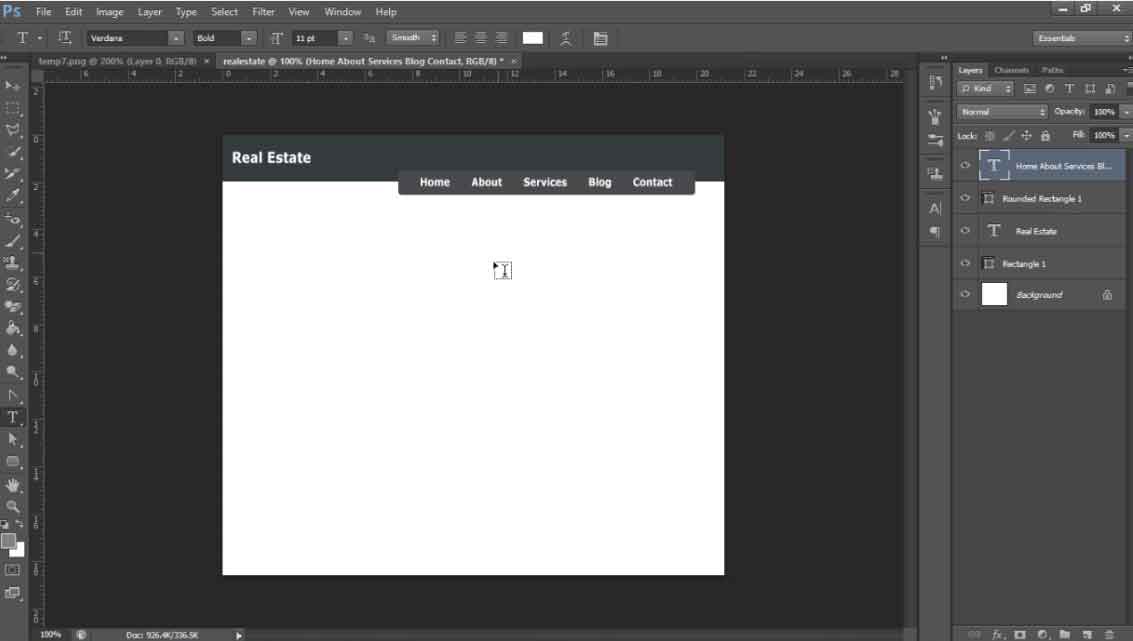
If you look at your original file, you'll see the home title is of different color. Pick that color and go back to your file. Select Tyoe tool and the same menu titles text layer. When you hover your mouse over the document area with the text tool selected, you can see the cursor wrapped with dotted rectangle which means a new text layer will be created once you click on the document area. But if you move it over the text layer selected on the layers panel, it'll change to a plain cursor which means the same text layer will be modified. Click on and select the text HOME.
Go to the options bar Text Color option and choose the color from the color pallette. And the color of the selected text will be changed.

Now, we'll create the shadows below the menu bar. If you followed the path of the shadow in the original file using pen tool in path mode, you can see there's an irregular curved shape on both ends of the menu bar. Wecan create that using pen tool in shape mode. Select the pen tool and select faded black fill color in shape mode. Create a shape and place it below the menu bar layer on the layers panel so that even if you need to move it a bit upwards it won't affect the main view. Go to Filter > Blur > Gaussian Blur.
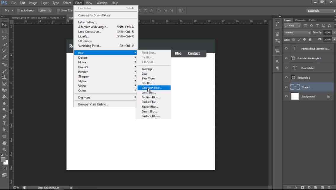
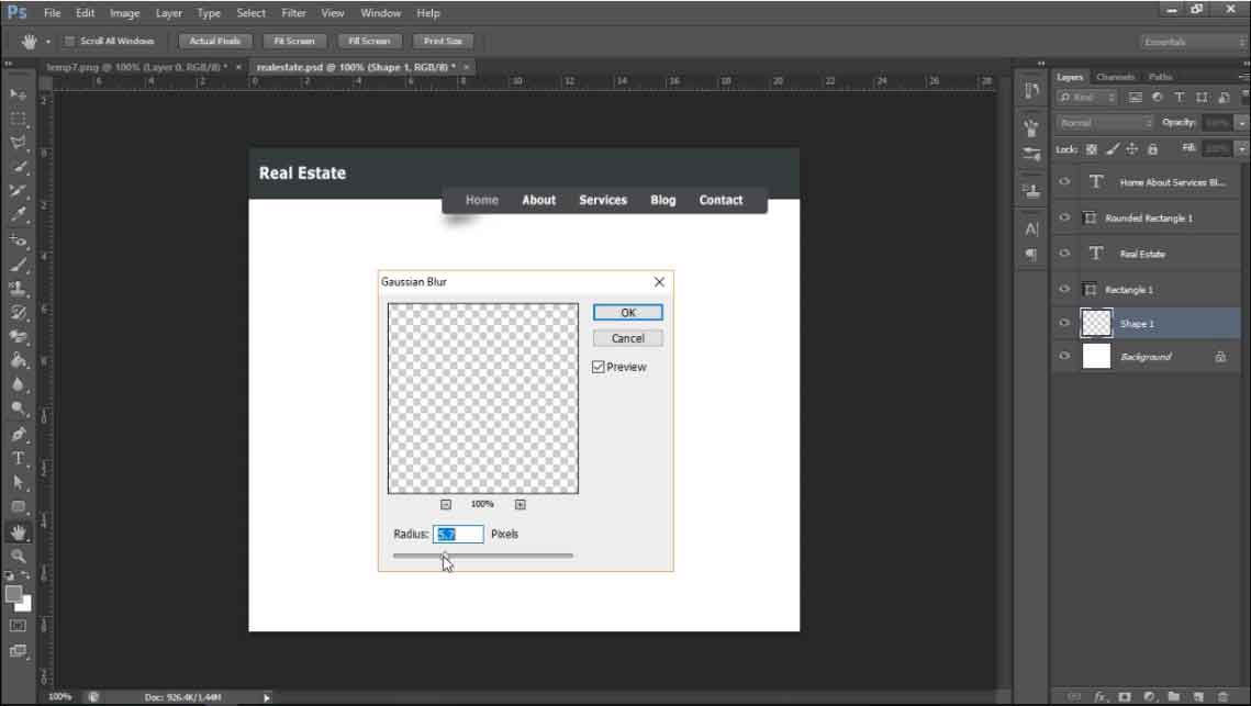
Photoshop will ask you to Rasterize the shape layer. Blur effects won't work on shape layers so the shape layers need to be converted to normal layers. Click ok and another dialog box will appear that allows you to define the blurness value for the layer. Select a value you want and the shadow effect will appear.
Duplicate the shadow layer. Select Edit > Free Transform or shortcut CTRL + T to get the transformation handles on the layer. Right click anywhere inside the transformation handles and select Flip Horizontal. Hold Shift and drag the layer to the other end. Holding Shift will allow you to move a layer in a straight path either horizontally or vertically whichever direction you move it first.
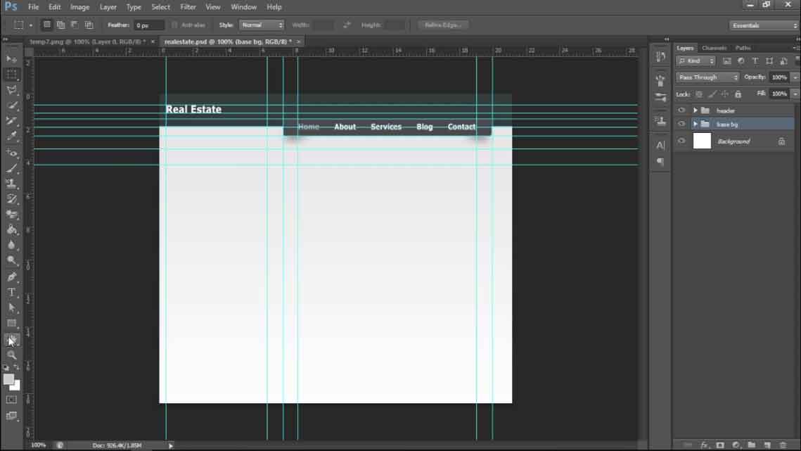
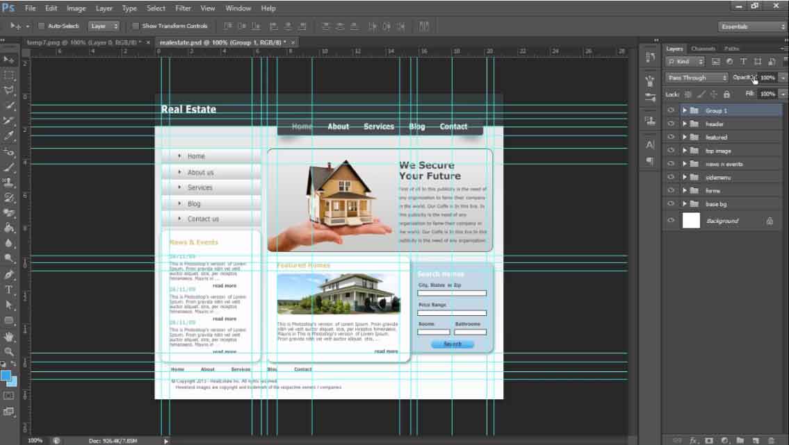
Now, you can group all the layers created so far leaving the background layer. Click on either the top most or the bottom most layer from the header section in the layer panel, hold shift and click the layer on the other end. All the layers will be selected. Either drag them to the Group Icon at the bottom and release or hit CTRL + G to put them in a single group. You can even click on the Group Icon first to create an empty group then select and drag the layers to the group layer and release them each at a time or all at once at your convenience. Keep in mind while you drag and release layers into group layer the last one to be dropped would go to the bottom of the group and you might need to rearrange them inside the group to rectify the visibilty of contents in workspace. You can rename the layers or group with a double click on their names on the layers panel. Your work so far should look like this.
Create Background Gradient
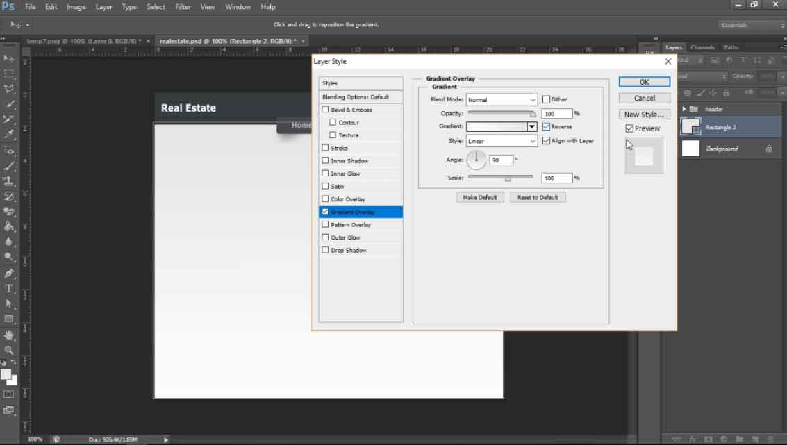
You can see the gradient fill in the background below the header in the original file. Let's pick those colors in our color pallette and go back to our file. We can add that gradient effect in our background layer after unlocking it but we'll create a new rectangle for that. Select the rectangle tool with shape option and any background fill color and create one below the header to the bottom. Make sure this layer is right above the main background layer and below all the layers already created and the below the ones that are going to be created. Now, we'll add the gradient overlay. Select that layer in the layer panel and either right click on your mouse and select blending options then click on Gradient Overlay or click on the fx icon at the bottom of the layer panel and cick on Gradient Overlay. A dialog box will appear with all the settings needed to add the gradient effects to the selected layer.
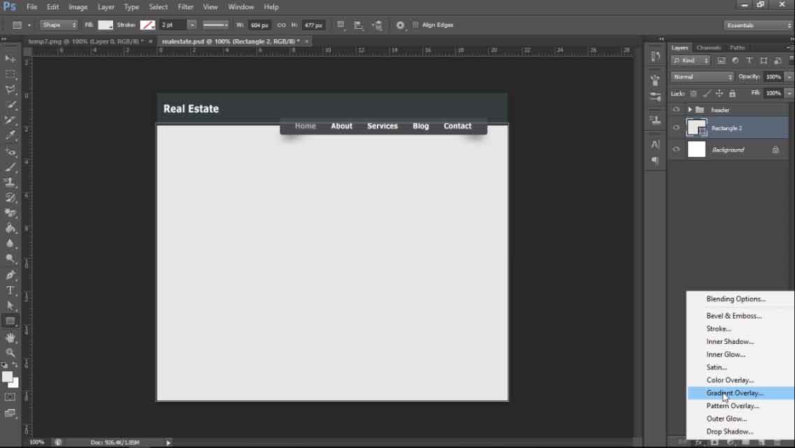
Click on the color bar in the middle of the Gradient options and the options avaiable on default will show up. The first gradient option would contain the colors you've in your color pallette in the tools bar. CLick on it and click ok. Then, you can see that effect on the selected shape in layers panels. Check for the colors combination in the gradient if that's just the opposite of what you wanted check the reverse option and it's done. Place the background shape in a separate group to keep the layers panel organized.
Sidemenu
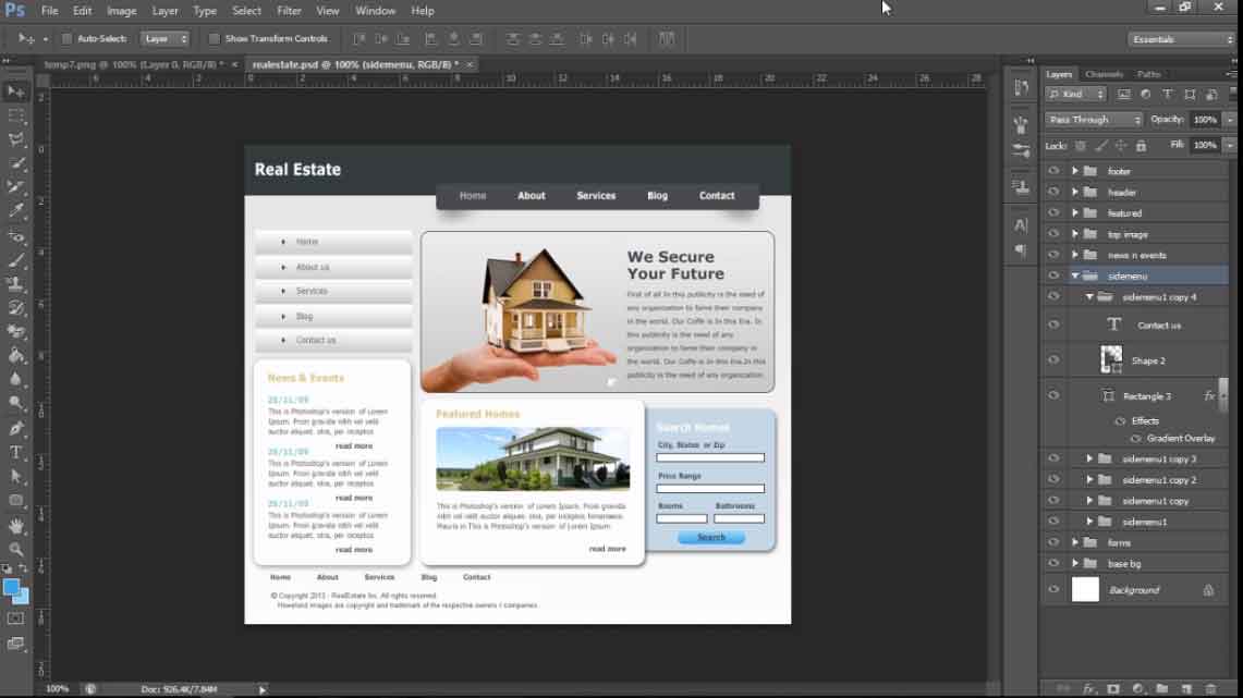
Now, we can move ahead to sidemenu where you can see multiple gradient boxes with menu titles on it. Let's take the measurement for one.
Now, we can pick both colors for this box using our color pallette in the tools bar and add gradient effect in it. Then, we can go to custom shapes to add a triangle, change its orientation, move it and resize or create one with the pen tool as well. Measure the spacing for the same and place it in its proper place. Measure the spacing between the shape and the menu text and add texts too. Group all these recent layers into a group and duplicate it a couple of times and move downwards. Go to the text layer of each of these groups and edit the text. Once done, we'll group all these sidemenu groups into a new group to keep the layer panel view cleaner.
News & Events
Now, we'll go to the News & Events section below the side menu. Measure the spacings to create guidelines and create a rounded rectangle with radius 10px and fill color white. Measure the inner spacing and create guidelines to add texts. Remove the disturbing guidelines using the move tool to drag them back to their origins. Pick the color for the heading and add text with needed adjustments. Pick the color for subheading and get the spacing guideline too. Add text and go for the paragraph. To add a paragraph, you can create a virtual textbox using the text tool and then go to Type > Paste Lorem Ipsum to get dummy texts. Make adjustments if needed. You can remove the overflowing texts from the paragraphs although they'll be hidden by default by selecting the texts to delete or enlarging the textbox temporarily to see all texts and select all at once and delete. Add the read more text on the right side of the box with desired adjustments.
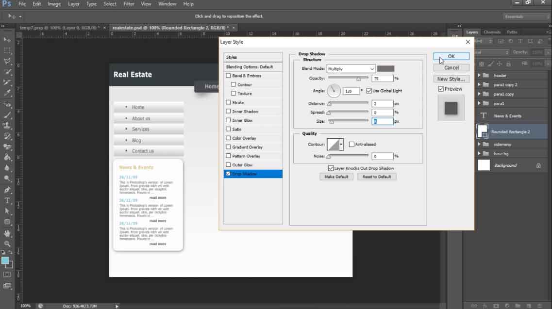
Now, you can group those recent three layers and then dupicate it to create the next two paragraphs below it quickly. Maintain the spacings in between. Finally, we'll add the dropshadow effect to the main box in this section using fx > Drop Shadow. Select a bit lighter dark color for the shadow effect and play with the distance and size values to create one that pleases you. Group all the associated layers and groups into a sing;e group.
Banner
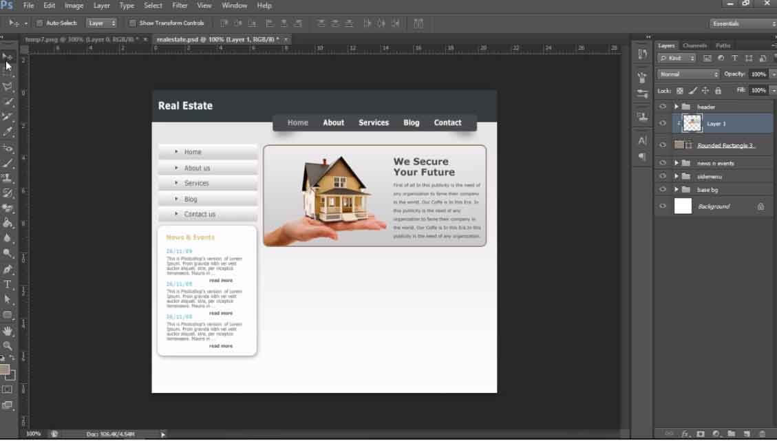
Let's go to the banner rection below the main menu on the right then. You can add an image on the left and texts on the right and place them inside a rounded rectangle but here we're going to show you another trick of photoshop. So, we'll move the entire banner image and text as a whole to our new file. Measure the spacings to create guidelines and place the image where it's needed to. Since the background color matches the cut out part on the corners we won't see any differences here but if the background color is changed it'll show up. So we'll create a rounded rectangle above the image to get the same size with the same border color the image has along with some fill color. Move the image right above the shape layer in layers panel and right click on it and select Create Clipping Mask. It'll hide all the areas of the image that extends outside the shape and gives us the same effect as in the original file. enlarge the image a bit to hide the borders of the image. Finally place them in a group.
Featured Home
Measure the spacings for this section and add guidelines in new file. Select and move the image using move tool and place it in your file. You can make a copy of the previous paragraph group, move it out of it's parent group and move the layers below the image in featured section. Remove the title and increase the width of the textbox to match the width of image using type tool. Add more texts if needed and finally put all of those layers in a single group and add drop shadow effect to the main box.
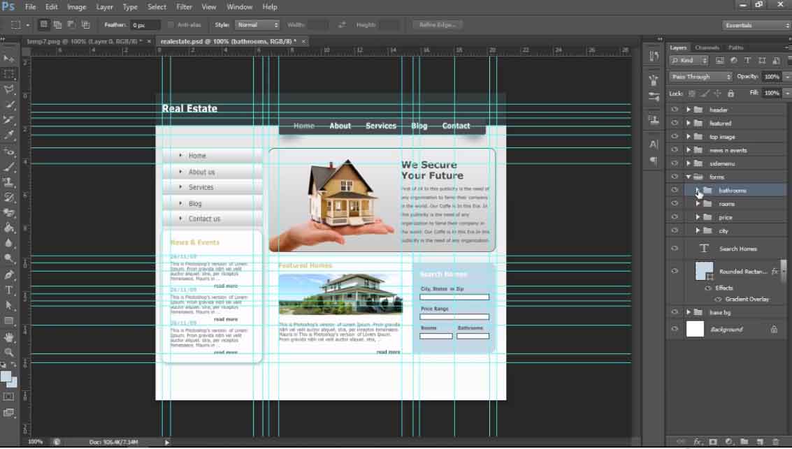
Search House
Take the measurements for the main box and create guidelines. Remove the guidelines that affects your vision. and pick background colors for the box. It seems like a gradient so pick both colors. Now, we can create the rounded rectangle but if you have a closer look at this shape, you can see both of the left corners are sharp while the right ones are rounded. We can create a siilar view by creating a rounded rectangle with width exceeding its guidelines on the left. Move the shape layer below the one on the left and the left corners will be hidden from the main view. Add gradient overlay but this time change the angle to -40 degree to create similar effect. Then measure the inner spacing for the contents. Add headings and the form fields. Place the form title and related field ina group and duplicate it to create more form fields easily.
The last row here contains two form fields. Add a new vertical guideline in the middle of the main shape using ruler on top as a guide. Duplicate the previous form group, change text and resize the from field. Make it's copy and move to the right.
Button
Since it's a more rounded button, we'll use the rounded rectangle with higher radius. Lets keep it 50px. Go to the original file and pick the colors using color pallette. Take measurements for spacing and create guidelines and draw the rounded rectangle. Add the gradient overlay. Select text tool with center alignment option and click on the button shape. The text will be aligned at the top center of the shape. Make required adjustments and move it to align vertically in the middle. Place both of them in a group. Add drop shadow to the main box.
Footer
Take measurements for the footer menu and add guidelines. Duplicate the menu from header and move it out of its parent group. Use type tool to adjust its width and make required adjustments. Create guidelines for the final texts and create another textbox using the type tool to add more texts. Put them in their own group.
Final Touch Ups
Now everything is done and you're very close to your finish line, you can hide the guidelines. Compare all the contents from the new file with the previous one and make adjustments. Here, We've got the header menu font size a bit larger than the original one, so, we'll resize them. The lines on the paragraphs have bigger height in the original ones so we'll select the paragraph layers and increase the leading from paragraph panel one by one. Our sidemenu titles are also larger than that in the original ones, so, we'll resize them too.
This way, you can create beautiful website mockups using photoshop ones that you can be proud of. For detailed video tutorial you can click here too.
Leave a comment