Every website designer tries to create attractive designs with nice little effects but sometimes the functionality and user experience might get overlooked while more weight is put on to make the website look fancy. That's when the site fails to make a good impression among users. The interface should look good but it's important to have a clean and logical display of contents which helps to make a site trustworthy and build a brand. This article analyzes 11 things you need to know to create a visually appealing website with better functionality while examining the differences between good and bad website designs. Hope, this helps the designers avoid such mistakes and create beautiful and functional designs.
An example of a bad wesite design
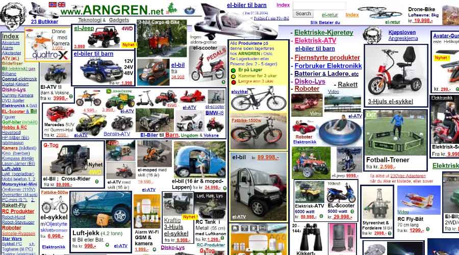
The example above includes most of the traits a bad website contains. So, lets enlist them for easy reading.
Common mistakes found in bad website designs
Here's a quick list of common mistakes that prevail in most of the badly designed websites.
- Gridless Design
- Poor Navigation
- Poor Color Scheme And Contrast
- Poor Typography And Readability
- Design Not Responsive to Devices
- Unrecognizable Buttons and Links
- Inconsistent Design Flow
- Lack of Negative Spaces
- Autoplay Media Files
- Long Page
- Lack of Interactive Elements
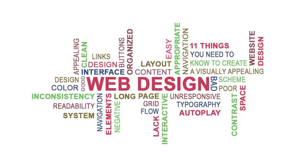
11 things you need to know to create a visually appealing website design
Lets sum up these mistakes and see how these elements make or break a design. Taking care of these elements would create a beautiful and functional website while ignoring thmem might create a mess.
1. Grid Design
Have you seen a site that has contents all over the places? All the graphics, texts and links sum up to create a huge mess due to lack of a proper grid system. A grid based design helps to keep everything in a site clean and organized. Proper spacing with clean and well organized contents adds consistency in a design.
2. Navigation
Navigation is very important in a site that helps a user to navigate through the pages. Navigations should be easy, clean and organized which should be appealing and pleasing to the eyes. Use of multiple colors with stark contrast should be avoided in navigation while it's placement as a horizontal row on top of the page would look simple yet appealing. Some designers tend to place the navigation elements at the bottom of the page. It might serve as a quick navigation option while the user scrolls to that point but placing them only at the bottom and forcing a user to scroll down to the footer area for the sake of navigation only is terrible.
Every once in a while, you might stumble into a site which consists a few isolated pages which don't include proper navigation. Sometimes, it mightn't even have a link to get back to the homepage. Avoid such pages in your work to get a better response from your users. Avoid horizontal scrollbar on your page as users are not used to it or add information about it to make it noticeable.
3. Color Scheme
Color should be used properly in a site that eases the user's eyes and makes the site effortless to go through. It shouldn't look like a color palette with conflicting background and foreground colors. You shouldn't add a huge number of colors unless it's a site for childrens or ladies fashion. Still, a combination of three colors excluding the primary colors i.e. black and white can be considered as a rule of thumb to keep the site simple yet visually appealing.
4. Typography
Proper selection of typefaces, font size and color is very important for a good website design. The contrast between the text color and the background should be easy on the eye which would make the content easily readable. Use of proper spacing along with size and color variations for titles, paragraphs and links to keep them distict from each others would make a great website while similar looking plain texts all over the page makes a website dull.
5. Device Responsiveness
With the advancement in technology and the introduction of multiple viewports for websites, more than 60% of the total internet users use smaller screens for internet browsing. Hence, device responsiveness has ranked as one of the most important fator that determines if a website design is good or bad. The contents of a page should be completely viewable and readable in any screen size automatically where the contents should adjust to the width of the devicescreen.
6. Call to Action Buttons And Links
Buttons and links in a page should be easy to identify which persuades a user to make a move in favor of the website owner. Avoid adding huge number of anchor texts within a paragraph which makes the overall look of the page ugly and even makes it harder to click the desired links on smaller devices. Higher number of buttons and links can put the users in such a state where they might prefer to do nothing instead.
7. Design Pattern
A good website follows a consistent design pattern from top to bottom of the page and all the inner pages. Use common style for all the main headings. Add a different style for sub-headings, another variation for normal texts, another style for links, another styling for important texts that needs to be highlighted. Try to use the color of the logo dominantly in the pages where the proven ratio is 4:5:1 which doesn't need to be followed strictly but considering it as a general guideline would do great. Moreover, the design and the color combination should be appropriate to the contents or the theme.
8. Negative Space
A website might look colorful and prominent with nice contrasting effect with the use of great colors but the lack of white space might turn it into a painting instead. The readability of the text might become poor with the use of multiple combination of colors. Use of white space which is known as negative spacing helps to keep a site simple and clean.
9. Autoplay
As a beginner in the field of web design, you might like the idea of turning on the autoplay option of media files i.e. audio and video files lo play them instantly with the page load. But, one thing you should always remember is that this autoplay annoys the users. Hence, it should always be avoided and the users should be the ones who decide either to play a media file or not on a webpage. Make sure, you've added the buttons to play/stop and navigate through the media objects.
10. Page Content
Unless your website is related to current news, it's better to keep the page short and simple. Most of the users don't go to the bottom of the page. It's always better to use pagination in case you've got huge content so that the users who want to go through the entire content would use those pagination links to go through in detail.
11. Interactive Elements
Your website might have a great design with great contents that get great responses from your users but lack of interactive elements such as like, comment or share options would depreciate its value over time. So, don't forget to add such elements in your pages.
Summary
Now, you know all the elements that are needed to be taken care of while creating a visually appealing website, lets sum up the good qualities that should prevail in a good website.
- Organized Content
- Clean layout
- Easy Navigation
- Good Color Scheme
- Good Typography
- Appealing Interface
- Appropriate Design
These are the general guidelines which state that a good design should be pleasing to the eyes, easy to navigate and readable providing excellent user experience. A designer should consider the overall look of the website and make it beautiful but it also needs to be functional.
Hope this article helps you understand and differentiate between a good and bad website design and makes it convenient to you to avoid these mistakes and integrate great visual appeal along with better functionality in your designs.
Leave a comment